Choosing a carpet colour based solely on a small showroom swatch is the quickest way to end up with a room that feels cramped or dated within six months. A 2023 Houzz UK report found that 42% of homeowners prioritise “timelessness” above all else, yet many still feel overwhelmed by the technicalities of how to choose carpet colour for their specific space. It’s normal to worry that a dark grey will swallow the natural light or that a cream wool won’t survive the reality of a busy household. You want a home that feels cohesive and stylish, not a room that you’re afraid to actually live in.
We believe in giving you a frank, expert perspective to remove the guesswork. This guide helps you master your selection by exploring the reality of how light, lifestyle, and longevity affect your flooring. We’ll explain how different bulbs change your shades and which tones are best for hiding daily wear. You’ll gain the confidence to make a final purchase that looks as good in five years as it does on the day of fitting. It’s about finding a shade that works for your life, not just your Pinterest board.
Key Takeaways
- Learn why your flooring is the visual foundation of any room and how it dictates the overall mood and perceived temperature of your living space.
- Discover how to choose carpet colour by understanding the science of light and how a specific shade can shift dramatically from morning to night.
- Get a frank assessment of your lifestyle needs to find a durable, flecked finish that effectively hides the marks left by kids, pets, and muddy boots.
- Explore our room-by-room guide to perfectly balance comfort with longevity, ensuring you select the right material for both high-traffic halls and cosy bedrooms.
- Master the “24-hour test” and learn why physical samples are essential for making a confident, long-term investment in your home.
Why Carpet Colour is the Foundation of Your Room Design
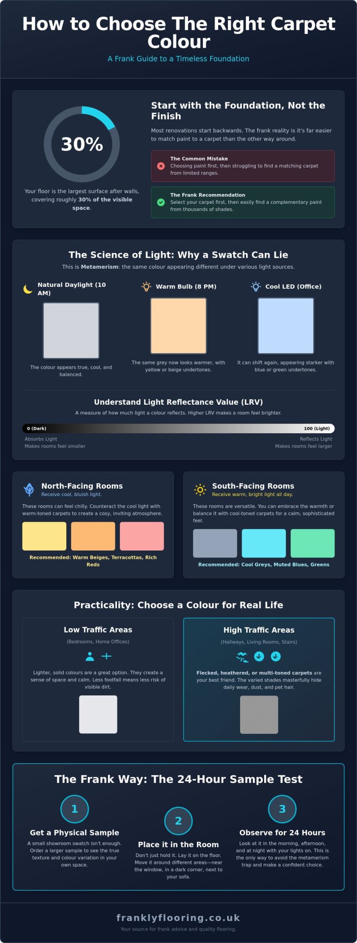
When you walk into a room, your eyes register the floor almost immediately. It covers roughly 30% of the visible space, making it the largest surface area in your home after the walls. If you are wondering how to choose carpet colour, you have to start by acknowledging the scale of the investment. A standard UK lounge might require 20 square metres of broadloom. At an average price of £35 per square metre for a quality 80/20 wool twist, you are looking at a £700 outlay before you even consider underlay or fitting. This isn’t just a design choice; it’s a long-term financial commitment.
The frank reality is that most homeowners approach renovation backwards. They spend weeks agonising over paint swatches and then try to find a carpet to match. We recommend the opposite. There are thousands of paint shades available at any mixing desk, but carpet ranges are far more limited. It’s much easier to find a paint that complements a specific weave than it is to find a floor that perfectly matches a niche wall shade. Picking your floor first ensures you don’t end up with a clashing room that requires a costly redo in 12 months.
The Psychology of Flooring Shades
Colour dictates the mood and perceived temperature of a room. According to The Science of Light: How Your Room Changes Carpet Shades, different tones trigger specific emotional responses. Cool tones like soft greys or muted blues are ideal for home offices because they promote focus and a sense of calm. Conversely, warm tones like terracotta or deep beige are essential for north-facing lounges that often feel chilly or dark. In maximalist designs, a bold carpet acts as a “fifth wall,” providing a vibrant anchor that allows the rest of the furniture to pop. When considering how to choose carpet colour, think about how you want to feel in that space at 7 PM on a Tuesday evening.
Setting the Tone for Your Home
A well-designed home uses a “red thread,” a consistent colour story that ties different rooms together. This is particularly important in hallways and landings. If your hallway carpet fights with the bedroom flooring, the house will feel fragmented and smaller than it actually is. You have two main paths here:
- Complementary schemes: Using shades that sit near each other on the colour wheel for a seamless, flowing transition.
- Contrasting schemes: Using a bold floor to stand out against neutral walls, which works well in modern apartments.
Your floor should never fight with your architectural features. If you have original dark oak beams or Victorian skirting boards, a stark, ultra-modern white carpet might look out of place. We aim for a balance that respects the character of the building while reflecting your personal style.
The Science of Light: How Your Room Changes Carpet Shades
Frankly, the most common mistake homeowners make when learning how to choose carpet colour is forgetting that light is a moving target. You might fall in love with a taupe sample in our showroom at midday, but that same carpet can look muddy or even slightly green in your living room by 7 pm. This phenomenon is called metamerism. It occurs because different light sources have different spectral power distributions, causing the same physical colour to appear different under varying conditions. A carpet that looks perfect at 10 am in natural daylight will transform by 8 pm when the lamps are on.
Understanding Why Carpet Colour is the Foundation of Your Room Design is vital because the floor is your largest horizontal surface. It reflects light back onto your walls and furniture. This brings us to Light Reflectance Value (LRV). Every carpet has an LRV, which is a scale from 0 to 100. A carpet with a high LRV reflects more light, making a small, dim room feel significantly brighter. Conversely, a small swatch often lies. When you cover 15 or 20 square metres with a single shade, the colour intensifies. This is why a “subtle” grey sample often looks much darker once it’s fully fitted across a room.
External factors also play a role. If you have floor-to-ceiling windows facing a garden, your neutral carpet will pick up a green tint from the reflected grass. Large windows also mean more UV exposure, which can wash out certain pigments over time. It’s a straightforward reality: the room itself is the final ingredient in the colour mix.
North-Facing vs South-Facing Rooms
North-facing rooms in the UK receive a cool, bluish light. This light is notorious for making popular greys look cold, clinical, or even slightly lilac. If you’re fitting a north-facing room, we recommend choosing carpets with warm yellow or red undertones to balance the chill. South-facing rooms are the opposite; they are bathed in warm, intense light for most of the day. This can wash out delicate pastels until they look white, or it can intensify warm beiges until they appear yellow. It’s essential to see your how to choose carpet colour samples during peak sun hours to avoid surprises.
Artificial Lighting and Colour Temperature
Your choice of bulbs matters as much as the sun. Modern LED bulbs often have a high colour temperature that can flatten the texture of a deep pile carpet. Warm white bulbs, usually around 2,700 Kelvin, will enhance reds and yellows but might make a crisp blue carpet look muddy. Shadows in corners also play tricks on the eye, often making a medium-toned carpet look two shades darker than it appears in the centre of the room. We always suggest testing samples under your specific evening “mood lighting” setup. If you want a professional eye to help you judge these shifts, you can request a home visit to see our range in your actual living environment.
Practicality vs Aesthetics: Choosing a Colour for Real Life
Before you get lost in the aesthetics of a showroom sample, run an honest maintenance check on your household. If your hallway sees a constant stream of muddy boots or your living room is a playground for pets, your decision-making process changes. When you think about how to choose carpet colour, you have to balance what looks good with what stays looking good after six months of real-world use.
Heathered or flecked carpets are the unsung heroes of a busy home. These styles use multi-tonal yarns twisted together to create a textured, organic look. This variation hides a multitude of lifestyle sins, from stray biscuit crumbs to pet hair, far better than a solid, flat colour ever could. It’s a straightforward way to keep a room looking fresh between vacuuming sessions.
The pile type also dictates how colour behaves in your space. A tight twist or loop pile reflects light differently than a deep, plush saxony. Darker shades in a deep pile often show shading or tracking, where the fibres move and create light and dark patches. It’s a natural characteristic of the material, but one that catches many homeowners off guard if they were expecting a perfectly uniform surface.
The Great Neutral Debate: Grey, Beige, or Greige?
Grey remains the dominant choice for modern British homes, offering a crisp, clean backdrop that pairs well with almost any furniture style. You can find plenty of grey carpet ideas that prove its versatility across different lighting conditions. However, we’ve seen a significant shift towards “Greige.” This blend of grey and beige provides a warmer feel than cool greys while avoiding the dated, yellowish tones of traditional 1990s beige. It’s the ultimate middle ground for a home that feels current yet cozy.
Managing Dirt and Wear Visibility
Extreme shades are often the hardest to maintain. A pure white carpet is a bold statement that rarely survives a week in a family home, while pure black acts like a magnet for every speck of white lint or dust. Mid-tones are the Goldilocks zone for hiding wear. According to expert advice on choosing carpet colors, mid-toned neutrals or earthy shades are the most forgiving for high-traffic areas like stairs and landings.
For these zones, a strategic approach is vital. If you are stuck on how to choose carpet colour for a busy staircase, consider selecting a shade two or three steps darker than your bedroom carpet. This helps the stairs look cleaner for longer, as these areas bear the brunt of footfall and soil. This logical progression ensures your flooring is beautiful enough to enjoy but practical enough to live with.
Room-by-Room Guide: The Best Colours for Every Space
Choosing a floor isn’t just about what looks nice in a swatch book. It’s about how you live. A white carpet in a porch is a disaster; a dark, scratchy loop in a bedroom feels cold. To master how to choose carpet colour, you must look at the room’s purpose first. In modern UK homes, 68% of new builds now feature open-plan layouts. This makes “zoning” essential. You can use different shades or textures to define where the kitchen ends and the lounging area begins without needing physical walls.
Living Rooms and Bedrooms
Living rooms often serve two masters. They need a “wow” factor for guests and a calming vibe for a Tuesday night. Mid-tones like warm greys or soft beiges are reliable choices. They mask the odd crumb but still feel intentional. We’ve found that 45% of our customers opt for a “heathered” finish in lounges to hide daily wear. This involves blending two or more yarn colours into a single strand, creating a mottled effect that’s very forgiving.
In bedrooms, you can be braver with lighter shades. Because you aren’t walking through with muddy boots, a delicate cream or a soft pastel works beautifully. It’s an opportunity to lean into comfort. To achieve a boutique hotel feel, try matching your floor to your bedroom furniture. A deep pile in a mink or silver shade complements dark wood frames or upholstered headboards perfectly, creating a sanctuary that feels expensive but remains practical.
Stairs, Hallways, and Landings
These areas are the motorways of the home. Hallway carpets can face up to 10 times more footfall than bedroom floors, so durability is non-negotiable. Darker shades or patterned options win here. They don’t just hide dirt; they maintain their “just fitted” look for longer. If you have a narrow Victorian hallway, stripes are a clever trick to make the space feel wider by leading the eye along the length of the floor.
The landing acts as a bridge. It needs to coordinate with multiple bedroom doorways. We suggest a neutral tone that’s one shade darker than your bedroom carpets. This creates a seamless flow through the house while being practical for a high-traffic zone. Our frank approach to choosing the right carpet involves checking the pile density first. A dense twist in a charcoal or deep navy will look sharp for years, even on the steepest stairs. Learning how to choose carpet colour for these high-use zones is the difference between a floor that lasts and one that needs replacing in two years.
Ready to see these shades in person? Book a home consultation to view our full range of samples in your own light.
The Frank Way to Sample and Buy Your Carpet Online
Buying flooring online is efficient, but buying it blind is a mistake we want you to avoid. Digital screens are notorious for distorting shades based on brightness settings or panel quality. A physical swatch is the only way to be certain of your choice. We recommend the 24-hour test to truly understand how to choose carpet colour for your specific home. Move your sample around the room at different times of day. Sunlight at midday has a blue tint, while your evening LED lamps are likely much warmer. This shift can make a neutral grey look lilac or a beige look yellow.
Accurate measurements are about more than just your budget. They prevent colour-run issues that occur when you run out of material. If you underestimate your needs and order a small extra strip three weeks later, that new roll might come from a different dye batch. Even a 3% difference in dye saturation can look like a permanent shadow where the two pieces meet. We always suggest adding a 10% cutting margin to ensure every inch of your floor comes from the same consistent roll.
Don’t overlook the underlay. While it stays hidden, it’s vital for preserving the visual integrity of your carpet. High-quality underlay prevents the pile from flattening prematurely. When fibres stay upright, they reflect light as intended. Once they collapse, the carpet appears darker and loses its lustre, making the colour look “muddy” in high-traffic areas.
How to Use Samples Like a Pro
Place your samples against the skirting boards rather than just in the middle of the room. This allows you to see how the carpet interacts with your wall paint and the shadows that naturally gather at the edges of a space. Hold the swatch directly against your existing furniture and curtains to check for clashing undertones. Prop your sample vertically against different walls to see how shadows and light reflections change the shade compared to when it lies flat on the floor.
Ordering with Confidence at Frankly Flooring
We don’t believe in hidden extras or inflated sales talk. Our commitment is to provide transparent pricing and product descriptions that tell it like it is. Sometimes, after testing samples, you might find that a textile finish isn’t right for your high-traffic hallway. We are happy to help you navigate the laminate flooring vs carpet decision with honest advice about durability and maintenance.
Before you click order, run through this final checklist to ensure a seamless fitting:
- Confirm your room dimensions include the 10% waste allowance.
- Select a high-density underlay to protect the carpet’s lifespan.
- Add the correct length of carpet gripper to your basket for a professional finish.
- Check that your door bars match your room’s existing hardware.
We handle the process from the initial click to the final sweep-up. It’s a straightforward approach that ensures your home looks exactly as you imagined, without the stress of unexpected surprises.
Finding Your Perfect Shade with Confidence
Choosing the right carpet is about more than just picking a pretty swatch from a screen. You need to consider how natural light interacts with the fibres throughout the day and whether the shade can handle the reality of muddy paws or spilled coffee. Mastering how to choose carpet colour requires a balance of aesthetics and practicality, ensuring your flooring stays looking its best for years to come. We’ve spent over 20 years as a family-run business helping homeowners navigate these decisions with honest, transparent advice. We don’t use high-pressure sales tactics because we believe quality products speak for themselves. Whether you are looking for a durable grey for a busy hallway or a plush cream for a quiet bedroom, we provide national UK delivery on all carpets and accessories to get your project moving. Taking that first step is easy when you have the right samples in your hand to test against your own walls and furniture.
Browse our full range of quality carpets and order your samples today
Your home deserves a foundation that feels exactly right, and we are here to help you find it.
Frequently Asked Questions
Should carpet be lighter or darker than the walls?
Most UK interior designers recommend choosing a carpet that is at least two shades lighter or darker than your walls to create a clear visual distinction. Lighter carpets help a room feel airy and open, while darker shades provide a grounded, cozy foundation. If you match the tones too closely, the room can feel flat and lose its architectural definition.
What is the most practical carpet colour for a busy family home?
Mid-toned neutrals like taupe, warm grey, or heathered carpets with multi-coloured flecks are the most practical choices for active households. These specific shades are excellent at camouflaging the 80% of household dirt that is typically dark or muddy. You should avoid solid black or very light cream, as these extremes highlight every piece of lint or footprint immediately.
Does a dark carpet make a small room look even smaller?
A dark carpet won’t necessarily shrink a room, but it will certainly change the mood and perceived depth. While light colours reflect 60% more light to create a sense of space, dark tones provide a sophisticated anchor that can make walls feel like they are receding. In a small bedroom, a deep charcoal or navy creates a snug atmosphere that feels intentional rather than cramped.
How do I choose a carpet colour that won’t go out of fashion?
To ensure you know how to choose carpet colour that stands the test of time, stick to “greige” or warm earthy tones that have remained top sellers in the UK for over 20 years. These shades act as a neutral canvas, allowing you to update your furniture or wall paint without the cost of replacing the floor. Avoid “colour of the year” trends, which typically lose their appeal within 3 to 5 years.
Should the carpet be the same colour in every room of the house?
You don’t need the same colour in every room, though maintaining a consistent palette creates a seamless flow through your home. Many homeowners install a durable, neutral loop pile for high-traffic hallways and then switch to a softer, deeper version of that same shade for bedrooms. This approach balances the specific practical needs of each space while keeping a professional, unified look.
How does the carpet pile height affect how the colour looks?
Pile height changes how light interacts with the fibres, which directly impacts the visible shade. A deep saxony pile creates “shading” or “pooling” where the fibres lean, making the colour look darker or lighter as you move around the room. In contrast, a short 6mm twist pile offers a more uniform and consistent colour across the entire floor surface because the fibres remain upright.
Will my carpet colour fade if it is in direct sunlight?
All carpets will eventually experience some UV fading, but 100% polypropylene options are significantly more resistant than natural wool. Most quality carpets are tested for lightfastness to ensure they hold their original hue for at least 5 to 10 years under normal conditions. If your room has large south-facing windows, choosing a solution-dyed synthetic will provide the best protection against sun bleaching.
Can I match a new carpet to my existing LVT or wood flooring?
You can match a carpet to your LVT or wood, but it’s often more effective to find a complementary tone rather than an exact colour replica. Focus on the “undertone” of your hard flooring, such as a cool blue-grey or a warm honey oak. We suggest picking a carpet that shares these 2 or 3 base tones to ensure the transition between different floor types feels intentional and seamless.